The situation
Prudential needed to redesign the North Carolina retirement-plan experience for employees eligible for 457, 401(k), and 403(b) plans. Enrollment was neither clear nor prominent on the existing site, and the state wanted employers to see that their people could understand and use what was on offer.
Design challenge
How might we help eligible employees understand the plans available to them and start enrolling, simply and without getting lost?
My approach
- Went through the existing experience, the traffic data, the customer needs, and the known usability problems. Enrollment needed to be the primary call to action, not one of several competing paths.
- Reorganized the hierarchy around four questions: why enroll, which plans apply to me, where do I get help, how do I start.
- Simplified the flow from orientation to action, cutting competing information so the next step was obvious.
- Prototyped it so stakeholders and users could test navigation, structure, and the primary CTAs before anyone built anything.
Outcome
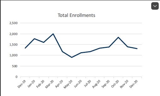
Enrollment became the primary action and eligible participants got a clearer path to it. The project also produced a better working model for connecting usability research, analytics, business goals, and technical feasibility. Enrollments were tracked over time against unique-visitor traffic to see whether it actually moved.